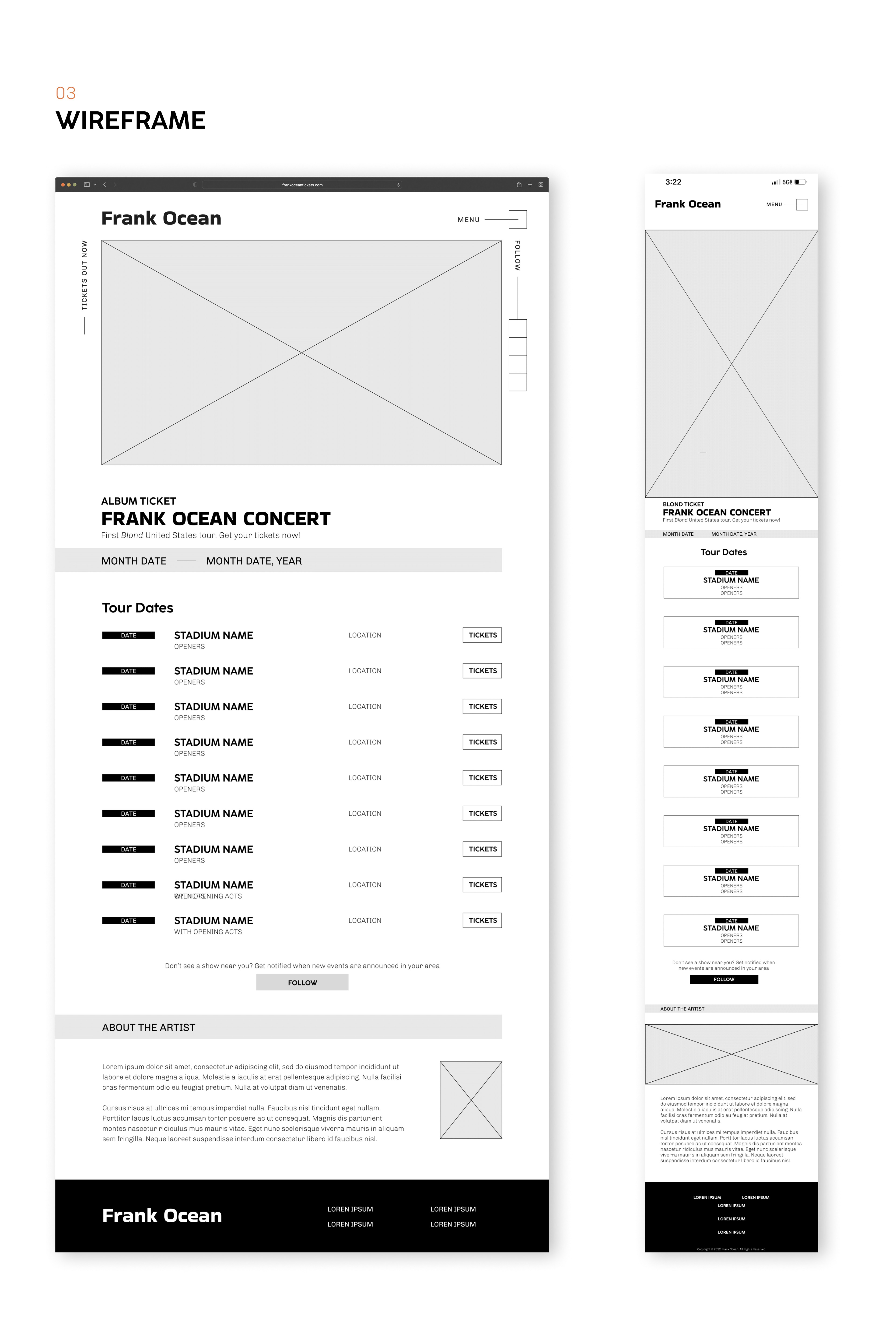
Known for his simplistic album cover designs, my approach to designing a concert website for Frank Ocean incorporates color blocking and simple outlines to keep the website clean and timeless. To maintain alignment with his branding, I decided to keep the color scheme simple, using the bright orange from his album Channel Orange, and black and white.
FRANK OCEAN: Web Design
You may also like
2023
LAYOUT EXPLORATION: Typography
2023
PROGRESS PARTNERS: Graphic Design
2023
ROOTED LIVING: Packaging Design and UI/UX
2022
A JOURNEY UNTOLD: Illustration and Typography
2023
VY ICON SET: Illustration
2023
TYPEFACE POSTER: Typography
2024
HOMETAP: Visual Design
2022
OHNO TYPE CO. OHNO FATFACE TYPE SPECIMEN: Typography
2022
THEMED LAMP: 3D Printing and Laser Cutting
2024
TRAVEL BUDDY: UI/UX